
I've said it several times already in this series, the thing to remember when designing something like a wargame rulebook is that it is a piece of communication. As such it needs to be clear, easy to understand and easy to navigate.
The only challenge you want to pose for your readers is when they play the game itself – reading the rulebook shouldn't be a challenge as it'll put potential gamers off before they've started. White space is your friend in achieving this goal, so don't be afraid of spacing things out on a page if it means it's easier to follow what's going on. Keep these things in mind as you map out the templates for your rulebook.
First of all, every document needs to be based around a grid. Why? Well, it keeps everything neat and tidy and means that things (like page numbers) are in the same place on a page. Repetition like this breeds familiarity, which in turn means that your document will be much easier to navigate for readers.
If you're final document will be a PDF or in Word the pages will only really be seen individually, but if you're having your rulebook printed you need to think in double-page spreads. Our hypothetical book will be created as spreads, so you just need to scale things back if working in individual pages.
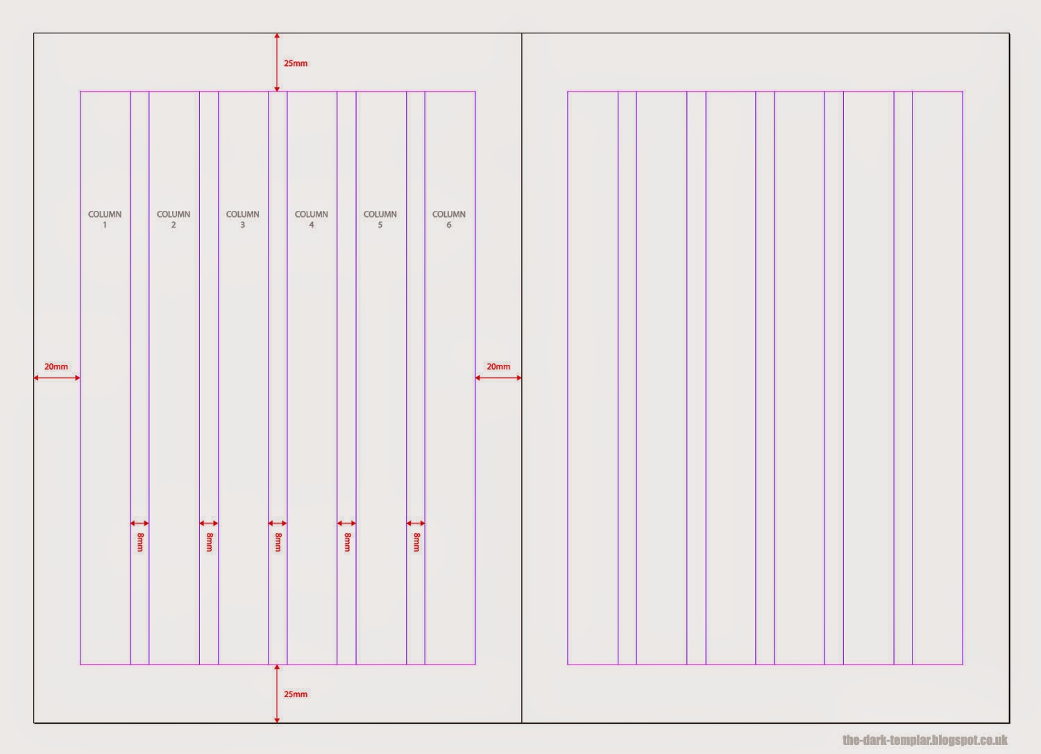
Keep text well away from any edges, neatly organised into columns. Most documents will be based upon a 2-column grid, but by having 4 or 6 columns you give yourself more flexibility with the design… if you can restrain yourself and not let things get out of control.
 |
| Double-page spread with grid established |
For our example rulebook – the hypothetical Humans vs Aliens – I'm using a 6-column grid on my A4 page, with 20mm borders on the left and right edges and 25mm on the top and bottom. I apologise now for the folks that use inches – even though I created the Aetherium rulebook using inches, I think quicker and more accurately in metric!
I've kept the column gutters quite generous at 8mm, allowing breathing space when the text does get heavy.
Next we're going to establish our basic navigation and text hierarchy.
 |
Our double-page spread is populated with navigation and template text |
Navigation
The navigation on the spread is made up of three elements:
• The page numbers, which I have positioned in the bottom left and right
• Section navigation, to the top right
• External links, along the bottom, to get people involved in the social media or to visit the website.
Most languages read from left to right, so our navigation is geared around this. The section navigation is to the top-right so it's easily spotted as people flick through the book to find the section they want. Similarly, the page number to the bottom-right supports this searching – the page number bottom-left is in case people flick through the book from back to front.
By adding links to websites and social media on every page you have a good chance that the reader will visit these places to find out more information or others who are interested in your rules.
Text Hierarchy
I have six levels of text established in the above example:
• Section Heading – big and bold so people know when they've moved into a new section.
• Main title – to establish areas such as the "Movement phase" and "Shooting phase" of the rules.
• Sub headings – allows you to break up areas under a title into things such as "making a charge move" or "shooting into cover".
• Body copy – the bulk of the text in your document will be at this size.
• Example text – when you wish to pick out an example within the body copy, italics make a good vehicle for this.
• Notes – like the example text but with added gravitas… you really need people to read this.
Elsewhere in the rulebook you're also likely to have tiny text for things such as copyright text, credits, etc. but these are the main type sizes you'll be using. Now that they're established, it makes life a lot easier as you start to design your individual pages.
 |
| Our double-page spread showing the grid (pink) and guidelines (blue) |
That's our template stage almost done!
So now we have everything in place we need to layout the actual text and decide what visuals (if any) we're going to add to the pages.
To be continued…