 |
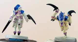
| Say hello to my little friends! I call the big one 'Bitey'. |
Hey Everybody, Chaosheade here with the promised update on painting
Hive Fleet Balor and two finished test models. They are a little rough and a bit sloppy but I wasn't terribly worried about perfect results. I just wanted to get some paint on them to see how the paint scheme worked and I like how it turned out. I also have my light box with some more proper lighting set up so the pictures should be better quality than they have been lately. Full details and analysis after the jump.
Well, things went very smoothly for painting my first test models. I didn't test every idea I had in
my previous post about the paint scheme but I did stick to the plan and I am very pleased with the results. The only differences between the two test models are the base coat and a couple details on the mouth, eyes, and carapace. One day I will post a full step-by-step guide on how I painted them with pictures of each step. For now I'll go ahead and do a quick run through on how I painted these two models. Let's call the one on the left with the lighter skin #1 and the one on the right #2.
VMC = Vallejo Model Color
VGC = Vallejo Game Color
FA = Folk Art (craft paint)
1. Prime with white gesso. I mixed some plain white Liquitex Gesso with some Liquitex Airbrush Medium and sprayed the crap out of them. Yes, that does mean I got an airbrush setup. I promise the
Adventures in Airbrushing posts will catch up with full details.
 |
| #1 and #2 to show the difference in base coat colors. I really like the pose on #2. He looks like eager to jump on someone and tear their face off. |
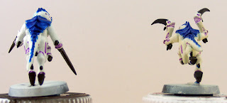
2. Base coat: 'Gant #1 was given a base coat of VMC Ivory with some VGC Dead White zenithal highlights that didn't show up as well as I might have wanted. #2 started off with VMC Pale Sand then some zenithal highlights with VMC Ivory and then VGC Dead White. All of this was done with an airbrush. #2 is definitely darker overall and I would like to start with the darker pale sand base but go heavier on the zenithal highlighting for more dynamic highlights and a brighter overall color; closer to the color of #1 but with more depth and shadows.
 |
| Top and bottom views of #2 to show the zenithal highlighting. There is definitely a difference between the darker underside and the lighter top side but there needs to be more contrast between the two. |
3. Once the base coat was done I started working on the joints and other little fleshy areas on the skin. These were given a purple wash using Les' Wash Recipe from
Awesome Paint Job. I started off with a light coat of wash but it was not nearly dark enough so I gave it a second heavy coat which darkened it up nicely. I think it wouldn't hurt to make it a little darker, perhaps 2 heavy coats of the wash. The tongues were painted with FA Perfect Purple and highlighted with FA Purple Lilac then given a purple wash to tie them together.
 |
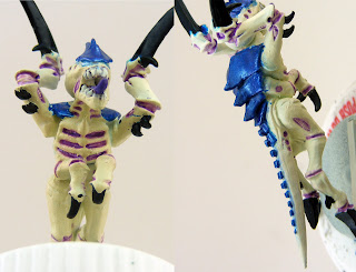
| Whoah! Extreme close-up! This will show the tongues and the details of the mouth and eyes covered in steps 4 and 5. |
4. Teeth and gums. #1's teeth and gums were painted with VMC Sunset Red and then I went back over the teeth with VMC Ivory. #2 was done similarly but with the Ivory over VMC Flat Brown base. I am strongly considering using the FA Perfect Purple as the base gum color instead of either of the two test colors I used here.
5. For the eyes I tested out a few different things on #1. I tried VMC Andrea Blue but the color was too strong and stuck out way too much. Then I tried mixing up a faux Citadel Ice Blue using VMC Andrea Blue and VGC Dead White as per the
Citadel color mixing chart featured in
this blog post. The "Ice Blue" was too light and did not show up very well. The third method I tried was VMC Light Turquoise with some watered down VMC Ivory painted over it to blend it in with the skin color. This turned out far better than the previous two attempts. #2's eyes were painted with FA Metallic Ice Blue. I'm not quite sure which one I like better but I'm leaning towards the turquoise/ivory. Whichever color I pick, I will be using it for all the eyes and most misc. details on the rest of my army.
 |
| This is their 'good side' |
6. The scything talons and other "hard" parts of the models were painted with Vallejo Panzer Aces German Tank Crew (Black) thinned with black ink to give it a very deep black color and a bit of a shine. I used the Panzer Aces black because
every other black paint was out of stock when I placed my order. At some point I would like to pick up some VMC black paint, both matte and glossy, but this will work for now. I plan on testing out some blue edge highlights on the talons but did not get it done on these models. Just for kicks I tried giving #2 a heavy blue wash over the talons to see if it would do anything, but the only discernable difference is that part of the skin got blue on it. You can kind of see a little bit of blue in the picture but there is no visible sign of the blue if you see it in person.
 |
| The only visible sign that the blue wash was applied. Also shows the shading/highlights on the tongue a little better. |
7. Finally, my favorite part: the carapace. I used my own metallic blue mixture made from FA Metallic Blue Sapphire with a pretty large dose of Daler Rowney "Rowney Blue" ink to make it a nice dark, rich, royal blue color. The FA metallic blue straight from the bottle was much lighter than I wanted it to be. After a couple coats of my Metallic Blue concoction I tried a couple different things on each 'gant. #1's carapace was given a blue wash that did not change the appearance very much. It did make it a little darker and took away some of the metallic shine which is not something I want to do. On #2 I tried to get a purple iridescence and although it's not showing up in the pictures I think I figured out the method to get it done. I started with some very watered down FA Metallic Amethyst and added some Daler Rowney Purple Lake ink to darken it up some. I then drybrushed some of this mixture on the carapace of #2 and I got the results I was looking for. When the light it right, you can see the purple pearlescence show up just like I wanted. The only adjustment I need to make is adding more ink to darken the color some more. It will look spectacular with a nice rich royal purple sheen instead of the light purple color that it has now.
 |
| Carapace colors. You can see the effect of the blue wash on #1 but the purple on #2 does not show in the picture. |
And there you have it. I will get one more test model painted up with the stronger zenithal highlighting, the blue edge highlighting on the black talons, and the darker purple pearlescence on the carapace. I would like some opinions on the eye/detail color and which one others prefer. I'm leaning towards the turquoise/ivory but the metallic ice blue doesn't look too bad either. Any other feedback or suggestions would also be greatly appreciated. I'd like to know what people think about the color scheme in general or any specifics that you might have an opinion on.
Coming soon: more
Adventures in Airbrushing and another Tyranid test model. I'll be back with more same bat time, same bat channel, so don't touch that dial. Don't forget to leave a comment and let me know what you think. Catch you on the flip side.
 |
| RUN AWAAAAAAAY! |

