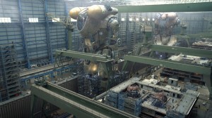
As you last saw I had come up with a chest armour design I was happy with and have spent the small amount of hobby time I’ve had available since transferring the design to plastic. I was happy with how it was progressing. Then my Pacific Rim art book arrived and one picture in particular grabbed me with its coolness:
Believe it or not that plate was actually originally a shot of a German cruiser ship factory which was then digitally painted over to create the Jaeger factory. You can see the before and after near the end of this article. Mind blowing! But what I loved most about that picture was the Jaeger design featured and suddenly I didn’t feel as confident with the torso armour I was building for the Centurion.
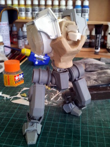
After a few days I couldn’t take it any more so I grabbed a clump of clay, mashed it onto the front of the torso and started sculpting away again. It took a couple of attempts but I finally come up with something that I really liked:
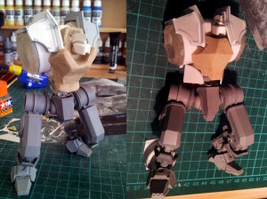
I’m going to try to articulate what I felt the problem was with the original design. You see, when you’re doing a design aesthetic with angled (rather than curved) armour plates, it’s tempting to start trying to form shapes mimicking curved surfaces using lots of polygons (much the same way as a computer 3D model works, except that the polygons are much smaller). The problem is that in my opinion it just starts to looks like a paper model. At that stage you would have been better off building proper curved armour. So the angled armour style needs to look deliberately angular; not polygons mimicking a curved surface. I feel that this new armour design achieves that far better than the first one.
Here’s a comparison of the two:
That’s all I’ve got for today. Now I have to make the new armour plating…


