So now you've seen an all singing and dancing layout last time, it's time to reel things in a bit.
For this next example I've tweaked the original and cleaned it up a bit. Gone are the cut-out images and things take on much more of a gridded appearance.

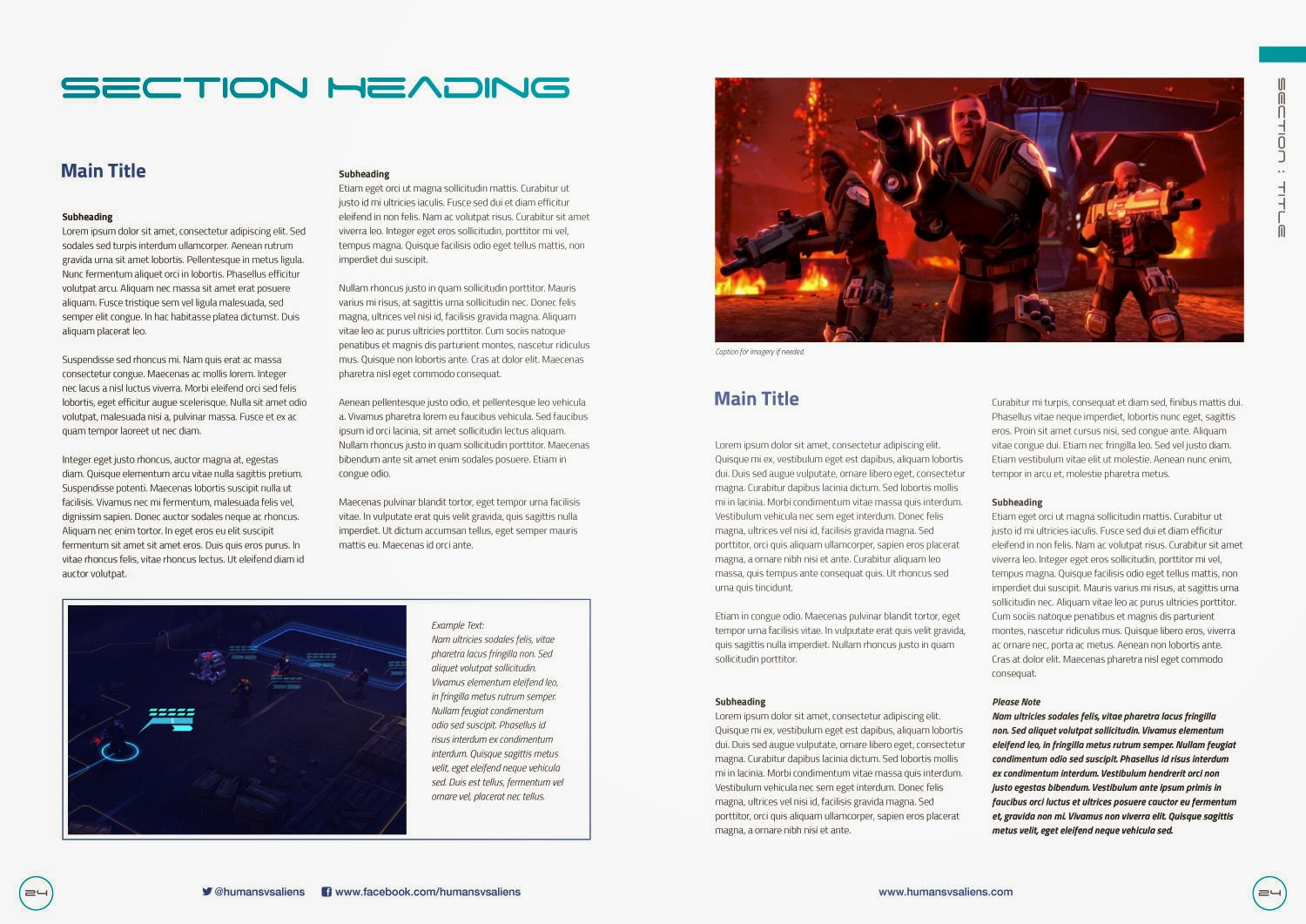
The main thing to notice is that we now have illustrative edges to the pages and these contain the page numbers and navigation. I've rotated the navigation text in the the top-right to read down the page and added a coloured tab. This demonstrates a way of colour-coding each section of your rulebook so that as people flick through they know exactly where they are at all times. Simple but effective.
You will also see that I've rotated the example box to now span the width of page one. Similarly, the image on page two is at the top of the page to counter-balance the example box.
Still too colourful?
Let's strip things out even more…
 |
| The slimline version… |
This is exactly the same spread, except the illustrated edges are gone. I've kept the colour-coding and added a coloured ring around the page numbers. This reinforces the colour-coding and make the numbers more noticeable.
 |
| Slimline with grids… |
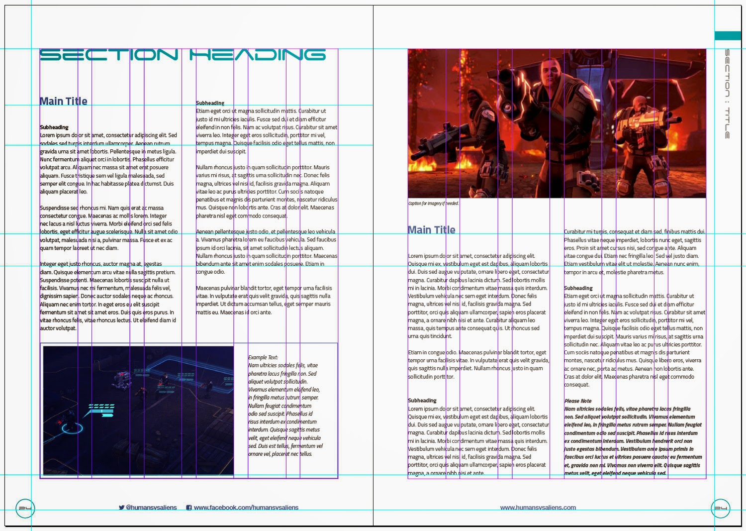
With the guides turned on you can see that our columns are still on the same baseline grid and things are still organised and considered. You may notice that I have altered the example box to make use of our six-column grid – the image now spans 4 columns to the 2 text columns.
This second design is still colourful, but it's restricted to the featured images rather than any peripheral 'distractions'.
If this is still a bit over the top we'd better have a look at something a lot more subtle.
To be continued…