 |
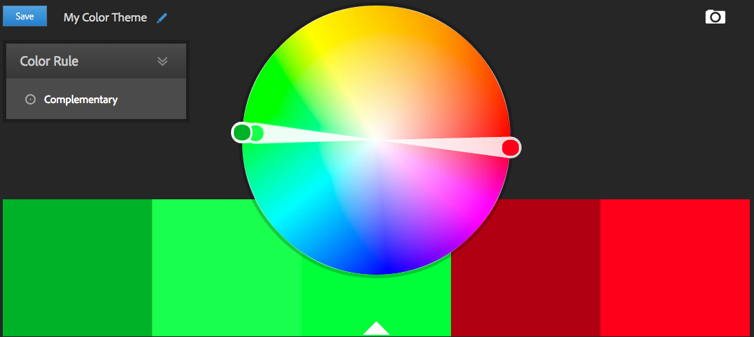
| Complementary: Green and Red |
From an artistic perspective, you can create a bold miniature with areas that really stand out. Human and armoured figures end up with trim, shoulder / knee pads, decals / tattoos that are difficult to miss. Aliens and beasts can have strong chitin, fierce claws or tribal tattoos / patterns that scream "Watch Out!" An army painted with complementary colours will draw eyes when it's on the battlefield because there will be a ton of small details that "pop" from the mass of your main colour.
Worth noting, if you mix 2 complementary colours together, they neutralize each other. That means you'll either get grey or a near-neutral almost grey. (More on Neutrals and Near-Neutral schemes later.) Also, don't confuse "Complementary" and "Compliment." These colours, while antagonistic, "complete" each other with a warm-cool contrast. (Colour Wheel Artist explains it well.)
There are a few ways you can apply this method. The first is probably more pleasing to the eyes and will not only flow better, but you can highlight specific objects and details strongly.
- Choose a primary colour for the bulk of your miniature.
- Paint anything you want to stand out with the other.
 |
| Created with painter from Bolder & Chainsword |
- Pay close attention to the size of the areas you paint each colour.
- Plan ahead so no colour is used more than another.
- Figures in uniform / armour can offer easy ways to achieve this balance.
- A uniform means the whole body might be covered in similar things and the same sizes, making it easy to balance.
Applying the scheme in 3 steps
Next I'll apply this scheme to a miniature, done in tabletop quality and in very few steps so it's easy for you to duplicate with your own figures.
I started out using a tip from SandWyrm to prime grey since I'd never tried it before. Grey primer worked well for darker colours and created a softer final product, different from my usual darker style. When you're choosing paints for a colour scheme like this, remember that you're not supposed to drift much around the colour wheel - for example, in this mini, I avoided any greens that seemed to have some yellow (olive) or blue (teal) to them.
(Optional) As a first step, I washed the whole model in Black to accent the shadows some. Then, applied a simple base coat in a lighter and darker green with grey accents.
In the busts here, I'm showing the difference between unwashed (left) and washed. (right) Used a black wash, which I usually don't recommend for colours, but made a point of using it on the grey, dark green and painted in the crevices of the light green areas.
For the next step, do the highlights. I started with a bright red, then a lighter one with a little grey thrown in. (Skipping this will leave the red brighter.) Then, I highlight the lighter green using a green with a little grey, the darker green with the same colour as the base and finally the grey with the same colour as the base.
While highlighting, I'm using a mix of techniques. I'm focusing on edges, but also filling in some of the open space. Don't be afraid of the brush stroke. It adds some texture and eye candy to otherwise boring open areas. (This is just kinda my style though.)
For the purity seals, I didn't want to go with a strong white, so I used a light green putrid flesh.
Below you can see the completed model. Overall, it's basically a green colour scheme. I've made certain details stand out using the red complement. Shoulder pad trim, eyes and the gun were the key details I wanted. The purity seals were a given too, then to balance around the back I added a little to the backpack too. Breaking the model up a little, I used blacks and greys between armour joints, on the gun, his chest straps and a few other places.
I got a question at the HoP regarding my choice of using the two different greens, which is best visible in this final photo.
I used two greens that were more or less the same hue, just darker / lighter versions of each other. Instead of being one whole green marine, a little bit of variance adds a little contrast and balance. Visually, helps the entire marine stand out because it's not one entire sheet of a single colour. Physically, I painted recessed areas the slightly darker colour and stand out stuff the lighter one. The upper legs for example are a little darker, fading them in to shadow somewhat and making the lower legs bolder in the stance he's in. Overall, everything stands out a little better.
| PREV: Introduction Part 2 | NEXT: Analogous Colours |
 This series on Colour Theory is intended to broaden our ability to paint interesting, unique or uniform miniatures. You'll learn how to choose pleasing combinations of colours and how to make certain accents or details stand out. Visit the Colour Theory Index for links to the rest of this series. This series on Colour Theory is intended to broaden our ability to paint interesting, unique or uniform miniatures. You'll learn how to choose pleasing combinations of colours and how to make certain accents or details stand out. Visit the Colour Theory Index for links to the rest of this series.For more in-depth tutorials for Beginner and Experienced miniature hobbyists, visit Wargaming Tradecraft. | |


