 |
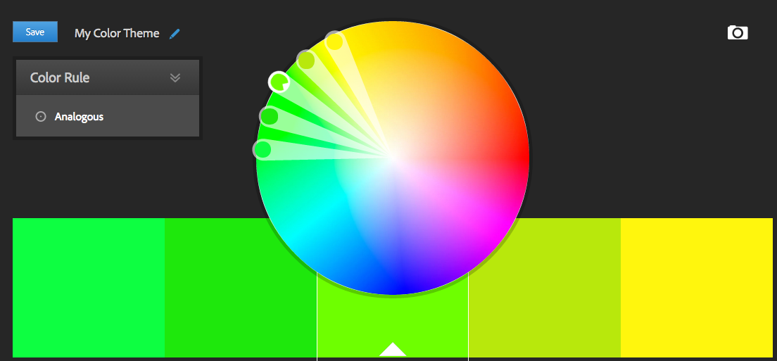
| Main: Green-Yellow (Lime) Analogous: Green and Yellow |
These colour schemes, often found in nature, are near each other on the colour wheel. They go together and blend naturally. I'm not talking about painting a model with just one colour - that would be monochrome, which I'll cover later.
The benefit of using Analogous colours is that they're pleasing to the eye and make the viewer feel comfortable. Where compliments are bold and shocking, everything flows nicely here, even the contrasting areas that stand out. From a miniature perspective, this is often used for races that live or fight in environments where they'd naturally or intentionally blend in or more precisely, camouflage. Armies painted with this method will look like a nice uniform mass of troops and vehicles.
Unlike Complementary Colours, where there's a distinct difference between the colours you're painting with, Analogous schemes can be difficult to paint well because contrasts are important:
- Choose 1 of the colours for the overall look
- In the shown scheme, Green or Yellow would be the most obvious, but an olive works too.
- Paint everything else using paints that will stand out.
- Includes shoulder / knee pads, trim, gems, hair, etc.
- If a model is mostly flesh, then armour and cloth would be considered extra.
- If a model is mostly armour, then flesh / cloth would be extra, etc.
- Contrast these other colours
- Don't make them all the same shade / hue, so if your main colour is dark, use some lighter or brighter versions of the other colours to make them stand out.
- Ex: If your main colour is a darker green, use a lighter or brighter green-yellow to paint something else.
A problem with your whole model being painted this way is it's hard to make certain areas really stand out. (Which isn't the idea of a analogous colour scheme.) You've got a couple options though.
- Use a super-bright or neon version of one of your colours.
- Ex: Neon yellow could really stand out on a mainly green miniature.
- Lighten / darken one of your colours, opposite to the shade of your miniature.
- Ex: If your miniature is painted with dark colours, accent with light.
If you want something to really pop - say eyes, hair or a gem, cheat and use a complementary colour. DO THIS SPARINGLY - Too much complementary colour will cause this to no longer be analogous.
- Ex: Red eyes or a tiny (red) ruby would contrast the Green-Yellow pattern I've shown above.
- If your main colour was Yellow instead of Green, Purple would be the compliment.
Applying it in 3 steps
Not quite as many photos as the previous Complementary Colours steps, but you'll get more next week when I look at Warm Colours.
Like before, I started with a grey primer, still worked alright with the darker greens. In the photo below, the left shot shows all the base colours and the right shot shows it with washes. Not a huge difference, but subtle enough to improve the overall look.
Below, the photo on the left is the marine still just washed, but also assembled. On the right, he's been highlighted.
For tabletop quality don't worry about highlighting until your model is assembled. If your paintbrush can't reach it, it doesn't need light. This also gives you a hand knowing what to highlight. You can see where shadows actually are.
For the yellows and lighter greens, I just used brighter colours to highlight each section. On the dark green sections, I used the original colour and mixed in some light grey to create a lighter tone.
Worth Noting: The picture on the left, assembled and washed but not highlighted - You could stop here. If all you're after is tabletop quality, highlight is sometimes totally optional. The trick is to choose paints that aren't too dark, that washes will have an impact on.
Regarding Colour Balance
Because I got the question last time, I wanted to touch on how I chose the colours to paint this marine. You'll notice that most of the lighter / brighter colours are in the front and around his middle. The darker colours are focused lower and from the back.
This causes the focus of the miniature to to be strongly front and center - this is where your eyes are drawn. For the sake of balance, I've still added a little light colour to the dark sections (his feet and backpack) and some dark to the brighter areas. (Fingers, shoulders, parts of his helmet and torso.)
On Details, Skill, Time and Patience
I want to point something out regarding his eyes. They look kinda bad. But as these are demonstration minis and I'm painting them tabletop quality, that's good enough. I'm not going to break out my good brush and take the time to outline the lens', fill them in, highlight / shade, touch up, etc..The reason I'm pointing this out is to say this: Some (many) details aren't all about skill, but instead, "patience." Choosing to take the time on details is what can bring your skills to the next level. I go in to depth in my article on Object Oriented Hobbying, but the point is this: If you want to up your quality, treat every part of a miniature as if it were a detail like eyes.


