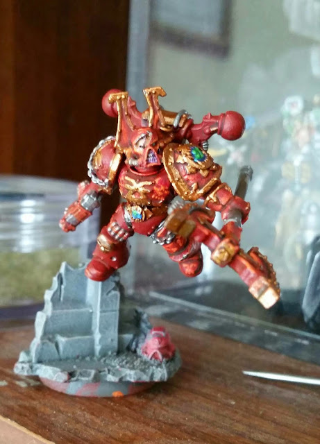
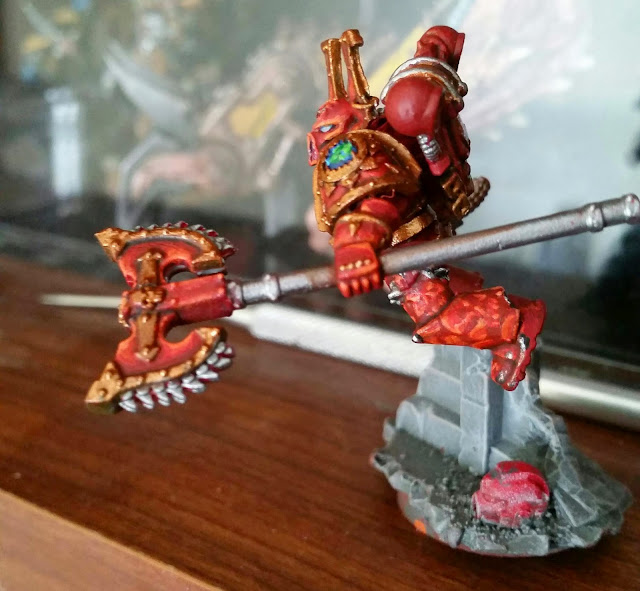
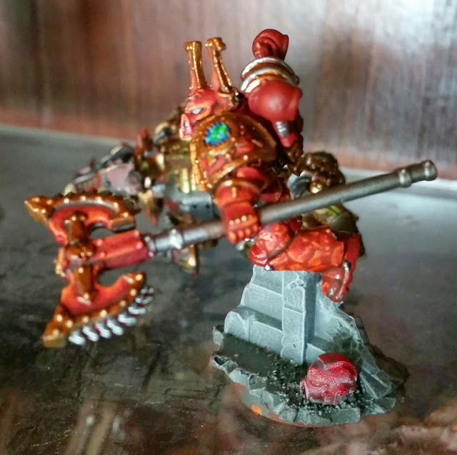
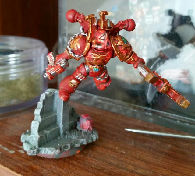
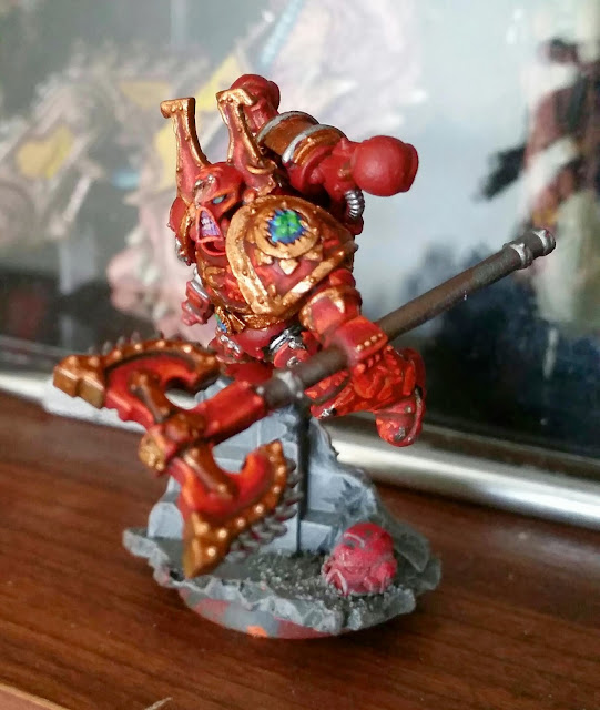
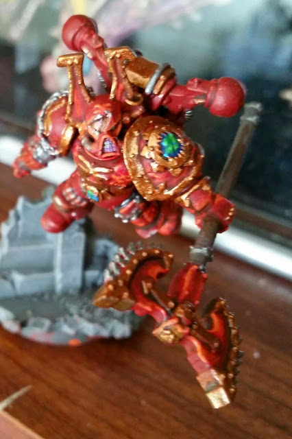
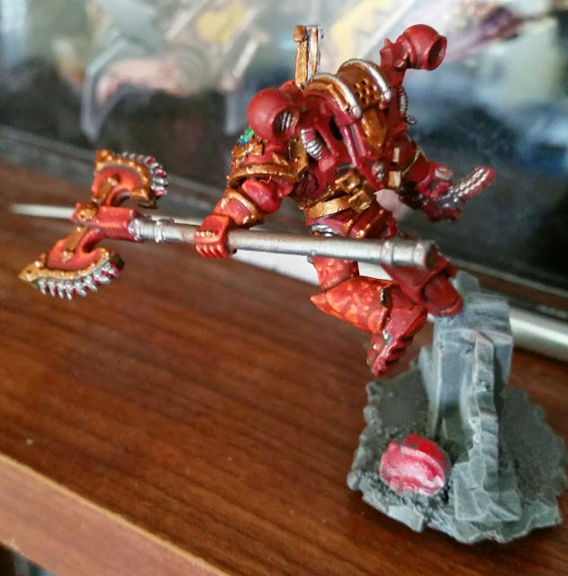
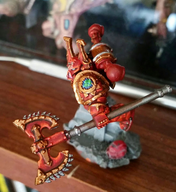
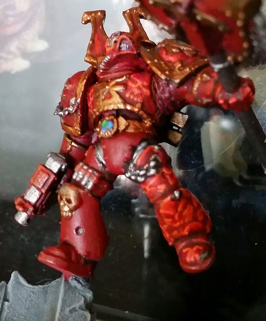
TJ here to ask for your opinions on a paint scheme I am working on for my World Eaters. I have free handed skulls and Khorne symbols on the larger surfaces. Right now only half the model has the new paint scheme applied to the red parts of the armor and most of the details are better visible in the photos below.
So the greave (leg armor) is a good example of the skulls. The skulls are painted by basing the model in Mephiston Red, then I paint the area where a skull will go Khorne Red, then I will start working the shaded areas of what will become a skull using Wildrider Red, then I highlight with a PP orange that I don't have labeled.
After that, I wash the area in Bloodletter Glaze, then highlight with Wildrider and the PP orange. As you can see on the axe and the helmet, I just build up highlights using those colors in areas where no freehand is present.
The breastplate also has skulls painted on it.
Please keep in mind the Brass and other colors/ whole areas of the model are not finished at all.
I have to thank Kraut Scientist for telling me to just go for it when it comes to choosing to do a Khorne detachment. I was wishy washy on it, but once I had another person pushing me, I gathered my resolve. This freehand is something I chose for two reasons.
The first is that I have a terrible background with freehand painting and have always been frustrated with it. This is how I will teach myself, by carefully trying not to ruin some complex, expensive conversions (because I am secretly a Slaaneshi masochist).
The second reason is simple; I don't want to have the same Khorne guys as anybody else. I figure if this is well received, then I will continue it and build my skill with the 8 zerks, then progress to bigger things, like Daemon Angron or a Lord of Skulls Berzerker Knight Titan, where I can combine experience with much larger spaces.
This last shot is just to show you where some of the free hand I have done falls. The reds in this photo are off, making everything look darker and un-highlighted, but It does make a lot of work visible.
At the end of the day, I just want to see what you guys think and what you would think of this pattern (or a similar pattern like cracked lava, khorne symbols ect) spread over a detachment. Is it cool, is it OTT, good, bad, ugly? Let me know what you think.
