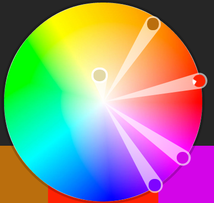
I wanted to take a brief look at some of the existing armies we play with and see how the developers have applied colour theory to them. It's funny, that after doing all this research, I find myself catching colour patterns in movies.
While you can paint armies however you like, not everyone is interested in the painting aspect of wargaming and that's ok. They just want to game and have fun. For these players, it's nice to have a variety of painting options, which is something Games Workshop offers in excess through multiple sub-factions within an army with their own stories and often with twists to the armies and rules to match. Privateer Press has more unification in their world without room for separate sub-factions, though I've seen some great ones that players have come up with. About the only colour diversity that comes to mind are different coloured sashes depending on which Trollblood Warlock leads your army.
It was interesting because it seems that Games Workshop uses more complex colours. The results are very pleasing and bold themes often with a single overall colour complimented by well balanced secondary ones for clean accents. A third colour, either complementary or distant enough from the main colours to be contrasting, is then used to bring smaller details to the forefront - things like purity seals, soul stones and eyes. Organic models like Tyranids use more blends of similar colours.
Many of Privateer Press' schemes are simpler. They often use Black or White to either contrast or create a harmony with a single colour or a range of analogous ones. Because of the time-frame of the setting, there's still a lot of greys and browns used as weapons, unpainted armour and cloth / leather.
 |
| source |
 Ultramarines - Triadic
Blue, Yellow and Red
Overall colour is Blue with many Gold / Yellow accents. Red is used sparingly to stand out.
 |
| source |
Red, Yellow, Green
Uses Red overall and Gold / Yellow accents, which are nearly Analogous and therefor a pleasing. Green is then a Complement of Red and used for small details to stand out strongly.
 |
| source |
Red and Green
Overall colour is Red with occasional Green details. White is used as an accent piece.
Other Examples: Cygnar - though for the strongest contrast, use Blue with Yellow-Orange instead of just plain Yellow.
 |
| source |
 Hive Fleet Behemoth - Double Analogous
Red, Violet, Blue-Violet
Strong amounts of Red, balances of Violet / Blue-Violet chitin armour. Violets and Lighter Red-Violets mixed in for biological parts and some weapons. Contrasting White weapons and claws.
Red, Orange and Yellow
Tones and Shades of Yellow / Orange to create Brown bone, Analogous and blending with the Red skin they protrude from.
Other Examples: Cryx, Circle Orboros, Skorne
 |
| source |
Violets, Violet-Blue, Blue, Blue-Green
Lots of Cool colours, with soft organic blends, tints, shades, tones of Blue and Purple. Some areas have brighter Red-Violet for fleshy contrasts. Also communicates the northern setting.
 |
| source |
Red, Red-Orange, Orange-Yellow, Yellow
Lots of Warm colours, but unlike the organic blends of Everblight, Skorne's armour is bold. Skipping Orange, it's sometimes used to highlight the Red and shade the Yellow. Also communicates the desert setting.
 |
| source |
Blue-Green
Much of Ret's theme is white overall, that make soft harmonies with lighter tints for glow effects. Contrasting this are darker shades and tones used for cloth and weapons.
You could paint this entire scheme using Trollblood Base and mixing with either White, Black or Grey.


