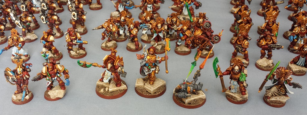
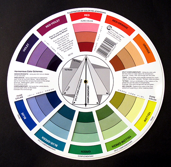
Here comes the blasphemy - real artists, brace yourselves*! Basic color theory as I apply it to painting. First off, the next two images below are not my creations, but have been the handy digital reference I keep on my phone when I need to do a quick check.
*Please feel free to correct/berate me in the comments if I misrepresent anything, I want to learn new things too!
Color Theory - There's a whole mess of knowledge to be had behind the idea of Primary, Secondary and Tertiary colors. For me it boils down to the idea that certain triads of colors (Red/Yellow/Blue, Red/Green/Blue, Cyan/Magenta/Yellow) can be mixed to form the various colors of the spectrum. However, as I generally steer clear of mixing colors this information is a little outside the scope of what I'm covering in the upcoming class. Definitely worth learning a little about however, the wiki entry covers the salient points and does provide a depth of insight I'll flagrantly oversimplify shortly! What I think of as a critical step in the painting process however is the idea of Color Harmony, what colors compliment each other when used together.
The three that I find most useful are Complimentary, Triad and Split Complimentary.
Complimentary - The colors opposite each other on the color wheel are called complimentary colors and generally end up providing the 'brightest' color contrast. Red and Green, Yellow and Purple, Blue/Orange (Go Boncos!) are definitely striking, but can also end up looking rather garish when paired half-and-half. I try to follow the 'three color minimum' rule so I don't really have any examples of models just painted in complimentary colors, but it's my go-to first step when trying to determine what color lenses that helmet should have, or what color the lettering should be to stand out on this hull plate, and so on.
Triad - The colors at equal points of a triangle on the color wheel form a somewhat more visually interesting combination. Again, the ratio in which they are applied is as important as the colors themselves. Applying them in equal measure is great for harlequins, but possibly overkill for marines. The Imperial Fists I've been working on are a classic case of the triad, yellow being the main color of the armour and blue and red being used as spot colors on the cabling/lenses and helmets/decorations respectively. Depending on the shades, triads can come off looking a little 'cartoony' (but I like a little of that in my 40k).
Split Complimentary - I'm a huge fan of the split complimentary, basically it shifts the opposing colors a little closer together and tends to feel a little more subdued/realistic. The recent Thousand Sons are an example of that, with the red/crimson as the main color and blue and green spot colors. A bit more muted overall but everything ties together nicely.
The Color Wheel - An actual physical color wheel is an indispensable tool to have, and basically is just a disc printed with all the colors with little spinny dials to help visualize how the various color combinations work. Pick one up from a local art supply store, you'll be surprised how much inspiration can be gained from just messing around with it. Alternately, for those more techno-savvy types with a tablet or phone, there's several online versions that are worth checking out!
Next up, now that we have a better understanding (arguably) of what colors to paint, it's time to discuss how to paint! ...Or at least, how I paint. More heresy to come tomorrow!
Categories
Recent Posts
- A Song of Ice and Fire: Brotherhood Heroes Box 1 2025/01/08
- Otty’s Tyranids 2025/01/08
- Monster Tauros done 2025/01/07
- Horus Heresy 2e Review: Horus Aximand 2025/01/06
- 6000 – Arbitrary milestone of the week 2025/01/06
.jpg)
.jpg)
.jpg)


