Color choice is the first artistic decision we make when painting a miniature. It can be an arduous and harrowing decision (especially if we spent hours upon hours converting a miniature.)
http://www.puttyandpaint.com/projects/498
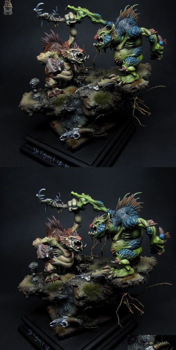
Jaroslaw has taken a bit of a bold move here by combining green skin tone with some blue body paint (on the chest.) Color theory tells us that green (blue combined with yellow) has an opposite of red. The mushrooms and the ponytail contrast very nicely with the green and provide a harmonious balance. Blue however, doesn't belong in any color scheme based on the color wheel. It's just too close in color to the green to be complimentary, so it has to be used in contrast. The shaman has this contrast used to great effect by making the face in green pop out from the chest in blue to truly bring your focus to the center of the figure. Nicely done.
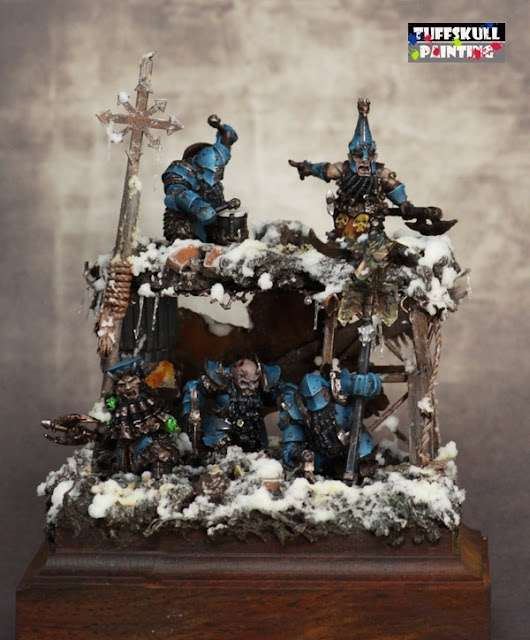
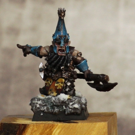
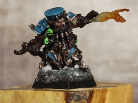
"Chaos Dwarfs" by Florian "Tuffskull" Weinheimer
http://www.puttyandpaint.com/projects/617
"Trolls Fight" by Jaroslaw Camelson Drabek
http://www.puttyandpaint.com/projects/493
And now, we're back to Jaroslaw ;) Scroll back up and take a careful look at the Goblin Shaman once more. If I'm not mistaken, you'll see almost every color in this diorama is present on that little shaman as well. The solitary missing tone is the red contrasting tone from the mushrooms and ponytail. By eliminating the red, Jaroslaw has formed a very cohesive tone pallette, with muted colors providing a contrast that is not present in more traditional color theory. The blue and green providing a striking contrast to focus the viewer on the defender suggesting as well the eventual winner, making the right troll appear more virile and stronger. Choosing a non-traditional color scheme can really make a piece stand out from the competition, but it truly requires an exceptional skill level to "sell" the complete composition. Also, try a test model first (such as a clampack mini ;) ) to make sure you can put the vision in your mind onto the sculpted surface. This juxtaposition of traditional color theory and color tones most likely contributed to the golden demon this diorama won.


