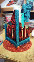
Then another wash of my turquoise craft acrylic, followed by another drybrush of turquoise/white mix and I think it matches quite well my Matt Black Hero of the Imperium statue.
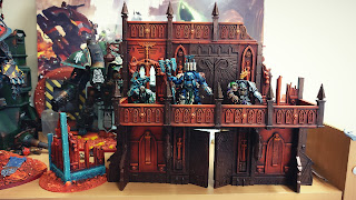
But putting it next to the big piece I was wracked with doubt about losing the bronze. It's such a consistent effect and will not stand out too much on the battlefield - tonal backdrop that does not detract from the miniatures.
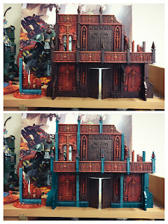
But I realised I could Photoshop it to see the end-result and with the small piece rotated I could copy+paste elements across.
I also got to conceptualise the red glass finials, although didn't add the patina in the door relief. Asking in the group got a mixed response but I think the majority said go for it.
The patina is my thing and as much as the terrain shouldn't take away from the models this is a piece in its own right.
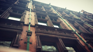
If you look around there are always architectural elements that do not fit a single aesthetic. Not everything is designed to be harmonious and share the same palette of colours so I'm going ahead with it... And while I was in Manchester I came across this example to illustrate my point.
Not sure whether it was the inspiration [long in gestation] because they're just green painted drainpipes, not weathered copper, but you get the point.
So, more turquoise next.


