 |
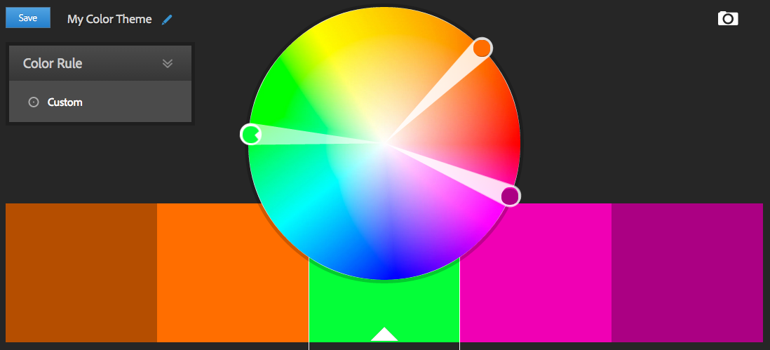
| Main: Green, Split: Orange-Red & Red-Violet |
You'll share many of the benefits of the complementary colour scheme - and that's strong contrasting colours that really stand out from each other. Unlike standard complementary colours, you've got a third colour to work with. These split colours are nearly analogous, meaning that while they're missing the middle colour, there will still be a blend.
There are three ways that you can go about using these colours:

Created with painter from
Bolder & Chainsword- Use the chosen main colour as your overall colour.
- The split colours become accents around your miniature:
- Use the split colours together to accent and blend various details.
- Use the split colours separately across the miniature to accent details.
- Use the split colours separately, but balanced across the miniature.
- Meaning, while the Main colour covers most of the miniature, you use an equal amount of the two Split colours for details.
- Use the two near-complementary colours as your main colour.
- Like Complementary Colours, your main colour can be used to highlight details you'd like to stand out, though a balance is still pleasing.
- Use a Balance of all 3 colours.
- Like standard Complementary Colours, it can be difficult to balance everything.
- It's easier with a uniform figure like a Space Marine and it's simple to balance.
These Colours Help Minis "Pop"
As you introduce more colours to the mix, you create a higher potential to make everything stand out, but with great power, comes great responsibility. Choosing where to place each colour can be tricky to make sure nothing is too powerful. Remember:
- It's best to choose a single overall colour and use the others to accent.
- Stay true to your colour scheme.
(Recognize the difference between, for example, green and yellow-green.)
Back to my old friend, White Primer. Again, I always recommend white primer to new artists. Grey was an interesting try, but overall I found it lacking the contrast I like from Black Primer and it doesn't have any of the advantages of White Primer. And I've heard the arguments: "Black Primer hides mistakes of new artists by filling in shadows." Trust me: If you're spraying primer on so thick that it gets in every crevice, you're spraying your primer too thick and losing detail. (I touch up missed areas with Gesso, paintable primer.)
So, I wanted to get a feel for each of the accents and decided to paint them first. Notice how strong the red-orange & red-violet is? That's because it's painted over White Primer - you get exactly the colour you want. I finished up by painting on the green.
Thin Your Paint
Notice how the paint's not one shade and has lighter areas? After dipping my brush in paint, I dip it in thinner, like water. Still thick enough to not be a wash, but thin enough that some of the White Primer shows through. I paint this heavier in to areas that'd get shadows and lighter on raised areas.
Wash Your Minis (Above)
Next, when I apply thick washes to the mini, It's basically already highlighted. The wash deepens the shadows, but all those raised areas I went easy on when painting with the thinned paint ends up looking even lighter.
Note: If I'd painted with dark colours, this trick doesn't work because washes contrast best against light colours. A dark wash over a dark paint doesn't stand out.
Final Photo (Below)
In the photo below, I've thrown a bit of a highlight on the orange and purple, but very little on the green. Most of what you're seeing in the green is the White Primer showing through the first layer of paint and the Green Wash leaving these lighter areas "highlighted".
I've pictured him with a couple of the other minis from this project to show how the colours you pick changes how a miniature stands out.
As a note: I probably wouldn't glue the two arms together before painting again. It's annoying to glue and doesn't fit the greatest afterward. Probably best to stick with painting each arm separate and gluing it all together afterward.


