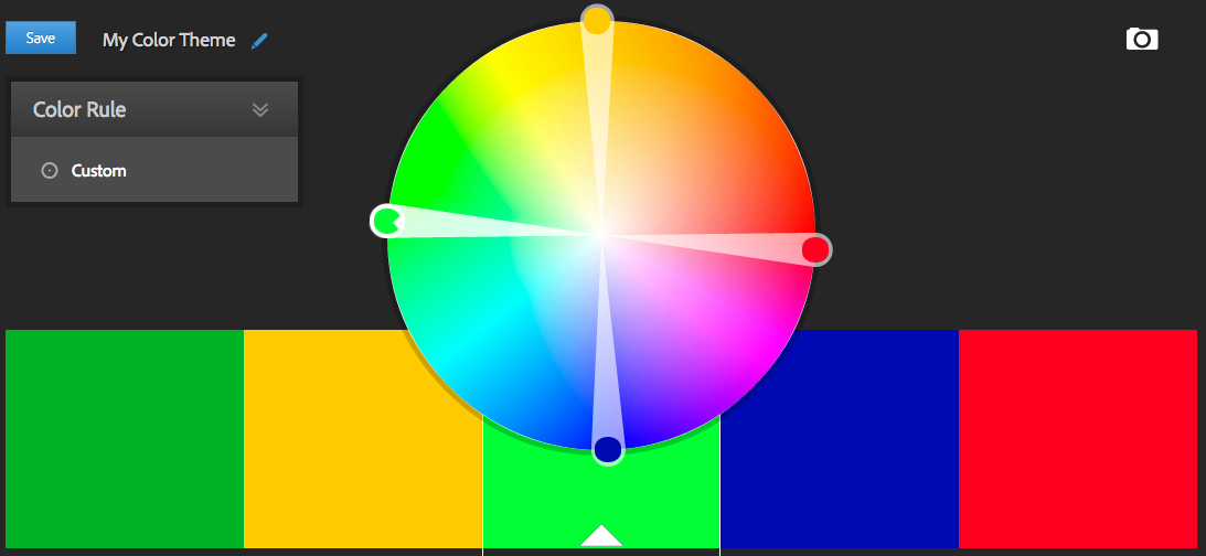
I'll be looking at two Tetradic Schemes - Rectangular and Square.
In both, we use 2 sets of Complementary Colours for a total of 4 colours. The difference between Rectangular and Square is how far apart the colours are spread. We have the benefit of more colours to paint with, however it becomes harder to balance all of them cleanly.
 |
| Created with painter from Bolder & Chainsword |
- Single Colour for the overall scheme
- Choose any one of your colours to be your main colour and accent details with the others.
- Details can be made to either flow with the overall colour using the same temperature colour or contrast using the 2 opposite temperature ones.
- You can use these Complementary colours together.
- Dual Colours for the overall scheme
- Balanced
- Using the 2 matching temperature colours overall.
- Make details stand out using the 2 Complementary colours.
- Unbalanced
- Using opposite temperature colours for the overall.
- Make details blend or stand out depending on the colour temperature.
Painting It
Nothing really new to show this week as far as painting goes. Like when painting with 3 evenly separated colours, I personally find that the colour scheme becomes boring. Very primary.
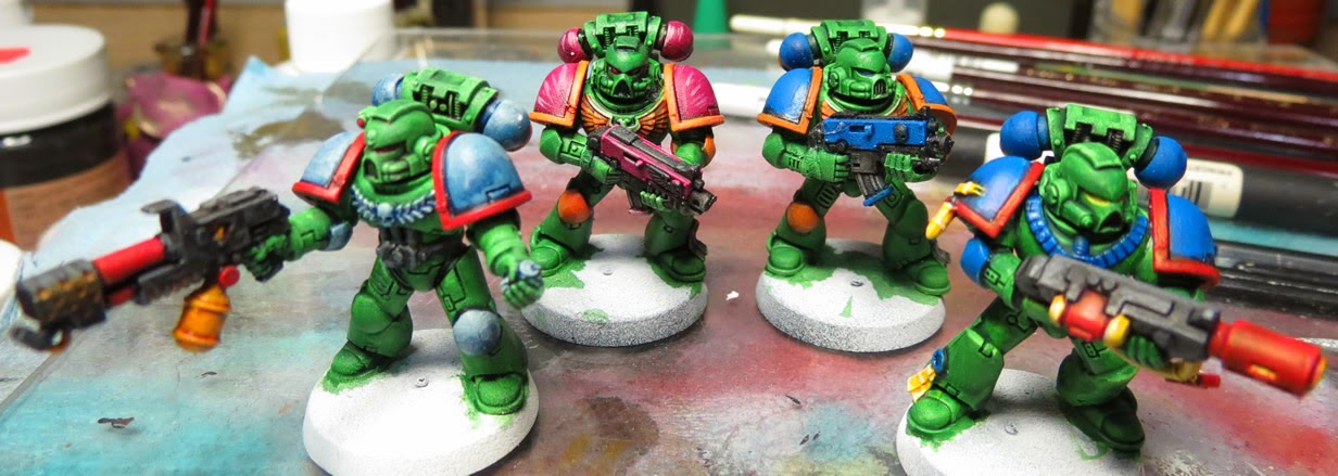
Below are the photos as I paint the base colours, assemble the marine and wash everything.
There's not much to do to highlight this marine and I use the same paints I based it with. This is a great way to paint, wash and highlight tabletop quality marines. The blue and red areas clean up really nice and the yellow was highlighted with a yellow / white mix for a softer highlight. (Menoth white to be precise.) Once again, because of how thin I painted on the green, it already has a lot of definition. When I "highlight" with it, I basically just clean up any of the areas the wash leaves looking a little rough.
Now, keep in mind, being that I'm only painting these minis for tabletop quality, there's still a lot that can be done to them to make them look nicer. But that aside, I still find the marines on the right in the bottom photo to be boring compared to the ones on the left. Evenly spacing the colours you use around the colour wheel just seems to have this effect.


