
I say “Composition” because I’m not talking about how to paint metal so much as how to create contrast by balancing painting techniques across a miniature.
See, when I began painting Non-Metallic Metals, I found that despite its pleasing tones, metal can end up looking flat and dull. You’re painting with the same colours used on the rest of your model so everything blends together. Since I’m a big fan of using contrast to make a model visually “pop”, when I’m painting with NMM, I’ll usually throw splashes of True-Metallic Metal on smaller details like bolts, rivets, buckles, etc.
As an example, take a look at the orange terminator here. Since everything is painted with regular paint, it all has a similar appearance. But, I used some colour variation – the orange is very strong and stands out boldly while the lighter colours like the cloth and golds are softer instead. The black metal parts are bold and strong too, but your eyes are probably treating them similarly to how they look at the orange.
I’m going to preface this by reminding people that I’m self-taught when it comes to art. This article is mostly theory and I’m talking about how things appear to me.
Here’s a more practical example: Jewelry
Jewelry catches light, shines, reflects and is (hopefully) noticed by viewers.
Not all jewelry is shiny, but those that are certainly catches the eye stronger than other types which might be flat / matte like our skin.
Another example would be glasses. Some people have dull rims that blend in to faces, others have brighter or shinier ones. How about buttons on clothes? Some are dull / painted and blend in, others are metallic.
It’s not just about saying, “Look at these earrings,” but to accent how we look and create points that pop out instead of an overall flat appearance.
That’s the whole point of this exercise.
Madrak
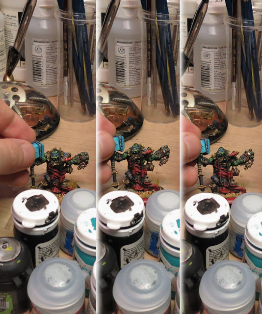
Compare instead to the hammer wielding troll below. It’s not metallic, but the gem he’s holding is a great example of what I’m talking about. It picks up the light and adds a certain dynamic quality to the overall look. In a smaller way, there are the True-Metallic rings attached to the wraps on his wrist.
From a composition standpoint, there are a few more details to consider:
- Skin, Gold and Brass
- – The tone of his green skin, yellow gold and orange amulet all catch the eyes similarly. His head blends with his collar, his fingers blend with the amulet.
- Blue hammer, Red tabbard
- – These are details that stand out, allowing your eyes to play over the model between significant details.
- Shadows and Highlights
- – This was one of the first Hordebloods I painted, trying out a new style and the contrast is perhaps a little strong. Shadows are really dark, highlights much lighter. This is another way of controlling the overall look of your model.
Then, take a look at everything from further away:
I used the gem in the example above because the effect is much more obvious in photographs that way. True-Metallic Metals don’t reflect nearly as strong, but it’s the same principle.
Doomshaper
Below you can see another example, just a simple one. The rings on his backpack have been painted metallic which create a nice central “pull” for your eyes among all the lighter colours.
Champion
As a final example, the orange-skinned troll below has a number of metallic and composition effects mixed in with his armour and weapons.
- Grey NMM Armour
- – This armour stands out strongly from both his skin and the red sections of his armour.
- Grey NMM Weapons
- – The white in the blades of his weapons stands out strongly. Because of the way it’s painted (lined) instead of a smooth blend, it creates a much more aggressive look, standing out from even the grey NMM of his armour.
- Gold TMM Accents
- – These points of light stand out around his armour. They stand out sharply along his arms in the brighter light and smaller points of light in the shadows around his hips.
- Bronze TMM Axes
- – This acts as a frame for the NMM blade. By having a shifting darker look here, the blades themselves appear even stronger.
The post Painting Mixed-Metallic Composition (MMC) appeared first on House of Paincakes.


