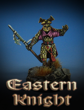
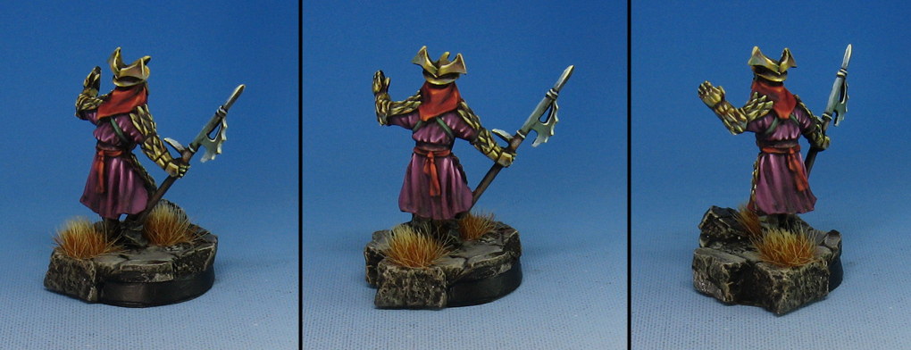
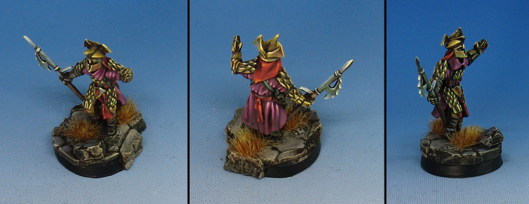
This is an Easterling in more of a 'standard' color scheme. I didn't want the gold to be too shiny, or pristine. There's a little more of a brassy look to it, which I felt would be a nice contrast to the two deeper red colors.
Speaking of the reds, the main tunic is shaded more towards purple, in order to create a bit of contrast to this deep purple. That smaller area of red is warmer, lighter, and more saturated.
I also tried to incorporate greenish tones in the armor, which would give the reds one more 'opposing color' to create contrast. this was also very muted, and toned down.
Combined with a few hints of grayish blue on the weapon, I think I have something that mirrors the appearance of the Easterlings in the shows as opposed to my own set of colors that I had done for my tournament army.


