 |
| My first two infantry stands. They are pdf bases originally cut for 288mm figures. I used blu-tak to even out the surfaces before adding the sand texture. |
Well here's a first! Painted space marines on my blog. And painted EPIC space marines from the 1989 box game to boot. These are just test pieces mind you, and represent me just fiddling around with the concept of painting tiny little plastic men, as opposed to not so tiny little metal men. A few posts back I was waxing not so lyrical about my love for the first edition of Space Marine, and these figures are the symptom of those thoughts.
However, though I can hold my own when working on 28mm figures, I am a complete amateur with figures of this scale - and I think that that shows! Usually, when approaching something more challenging than normal I would spend a few hours reading through as many forums, blogs and articles as I could unearth on the subject - looking for inspiration. Perhaps it was just me, but I wasn't really able to find much on the subject with the best information coming from the original Space Marine rulebook (thank you for that Steve Casey) so I was left pretty much to my own devices.
 |
| The appalling sight of crushed infantry stands. These days I stick to the rule of NEVER placing models on the floor. |
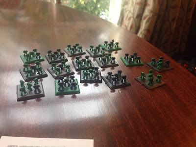
Having picked up a couple of lots of marines on eBay, and having received a few extras from Ian Wood (see above), one thing that struck me was how generic the stands look when assembled. With every figure positioned in the same X pattern, the forces on display didn't really look like the rushing mass of lethal warriors as the artwork portrays. Rather squads of static monopose troopers lining up on the parade ground.
 |
| Loose marines. Sounds like a dodgy US army amateur rock band. |
Having got a number of loose models, I stuck them rather randomly on a selection of pdf bases in an attempt to vary this look. My remaining bases have already been glued down, though snipping them from the original bases won't be particularly demanding if I like the effect.
 |
| These stands were already stuck down when I bought them. If I am going to stick withe pdf idea, I will need to come up with a way of removing them. |
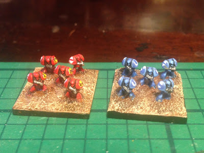
Following the advice of Jervis Johnson in the original Space Marine rulebook, I choose to represent the forces of the Ultramarines and the Thousand Sons on the table top, based largely on the fantastic photographs of red and blue epic scale infantry on the original photographs published in White Dwarf. Johnson, if it was he who wrote the painting section, recommended drybrushing to help bring out the detail and I followed the advice to the letter having found nothing else to go on. The finished result was very underwhelming, so I endeavoured to have a second crack at both bases.
 |
| My first attempts at chapter markings. |
This time I used my preferred technique of layering and washes and the results are far more pleasing to my eye. The general method I used was simple really. A dark base coat with suitable ink wash. I used blue/black ink for the Ultramarines and black/brown ink for the Thousand Sons. Once dry, I quickly painted over all of the raised services with the original base colour and added a few highlights to the armour, most notably the shoulderpads, helmet and legs. Black ink was then added to the chest and weapon area to create additional depth. Being an amateur working with this scale, I quickly realised that you needed to create far deeper depth effects and brighter highlights to bring out the best of these models.
Adding yellow to the red and white to the blue, I added additional highlights here and there and used the same method to colour the bolter in each marine's hands. Still, the models looked pretty bland, even with the bases completed. I decided to add further detail and add squad markings as best I could to the figures. The Ultramarines were pretty straightforwards, with me simply painting a white U on each shoulder pad and copying the two, reflecting triangle symbols that represent tactical squads on the other. My freehand painting was a little off the mark here, though I think with practise it will improve.
The Thousand Sons had the same attention. I added the tactical squad markings (which look better on the second attempt) and added a yellow sun with a black M on the other pad. You can just make these out on the top picture.
In conclusion, there are several things I will try and rectify on my second attempt.
1) Stronger highlights on the red Thousand Sons. I shall start with a darker base colour and work up, completing the final highlight in orange.
2) I shall paint the entire shoulder pad yellow for the Thousand Sons before adding the M in black. This should help define the letter more strongly.
3) Select a brighter more vibrant blue for the Ultramarine basecoat. My first choice was too pale.
4) Use black as a base for the white chapter detail on the Ultramarines to give further definition.
But before I do that, I shall ponder my technique a little more and have a look at what other painters and gamers have done with epic scale infantry over the years. If you know of a blog or other article that you think is worth reading, please share the link in the comments section below.
If you have your own method or technique for getting to grips with epic scale infantry please comment on that too. I would love to know!!
Thanks in advance.
Orylgg.