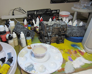
Tabletop World made a much needed addition to their line with the Small Cottage 2. Their town houses, inns, shops walls, gates, and mansions are mostly mid size to very large structures so its nice to get a companion to the Cottage 1 model.
Here you see my terribly messy and cramped work space. I tend to do this even when I have whole rooms available. Eventually we'll settle down and I'll build some paint racks to help with the access and clutter... buts thats for another time!
The Cottage 2 differs from the rest of the TTW catalogue in that it appears to have a slate roof instead of the usual wood shingle. At any rate it was my first go at doing slate and I learned a lot. the colors are fun but came out a bit too regular. Next time I'll do more partial tiles and work more on making the color boundaries irregular.
I was happy with the moss effects which liven up the walls. I've also tried a new way to do the stones which really sped up the process and looked a little better to boot! Basically I did the wood first and expanded some of the wood dry-brush step to cover the stone, most heavily near the wood,then washed back with a stone color which gave more color depth and better cover to the recess. then brushed up the stone to give good definition to the wood sections .

Even though the approach was different I wanted to stick with the Greystone Village theme instead of branching out into other colors of stone. I may do some other stone colors in future for buildings that aim to stand out from the bulk of the village.
For the interior I replaced the Spice Brown base layer of the wall color with Sandstone. The walls ended up being less warm, color wise, and help with the idea that these are lower end dwellings. I did a bit of sooting around the fireplaces and some progressive water damage in the floors.
Then, in a terrible "squirrel!" moment I decided to paint up the Dark Souls the Board Game...
I wanted to experiment with using different primer types to speed up the process and ended up with three primer colors.
I used Rust-oleum Universal Metallic Paint+Primer Metallic Aged Copper for most of the adversaries. This was the worst one of the set and remained tacky until I washed it with Secret Weapon Flesh. Seems to be OK now but time will tell.
The Player Character models got Rust-oleum Universal Forged Hammered Paint & Primer Antique Pewter. This did really well and the hammered effect might be interesting on larger models. Dried OK and took washes well.
I used Krylon Ultra-Flat Camouflage Khaki paint, which is designed for rugged use without primer, for the adversaries that were more "fleshy" or had little armor. I use this series a lot and it behaved as it always does.
These are board game pieces and I decided to do a "Good Guy" colored checker on the bases of the PC models and a "Bad Guy" colored checker on the bases of adversaries. The actual colors are TBD!
Here you see the Aged Copper after the flesh wash. The guy with the GINORMOUS bell/hammer is the mini that actually hooked me into getting the game.
On the game itself.... meh...
Its very, very, very grindy... much like the video game its based on. That would be OK except that you end up grinding over the same three tiles against the same adversaries that start in the same spots... the only difference being that the loot chest, if any, is only lootable once. The tiles are changed for a different three tiles at the halfway point and the grind continues.
So... the minis maaaaay end up getting re-purposed into a cool warband for one of our skirmish games!
And, finally, Three troops of Void Elf Hunters from Raging Heroes are under construction. I'll use these as Dark Eldar Kabalite Trueborn. Since they have a really cool helmet I'm thinking they will form the core of my nascent Ynnari force.


