Just a short – and belated – post for today, but one that is still very close to my heart: Thanks to the feedback of my fellow converters and kitbashers, I have been able to improve my recent model for the Doomwall. So here’s where we left off last time:

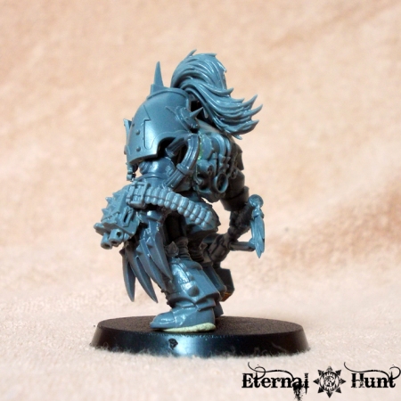
First up, fellow hobbyist Moltar suggested adding an ammo feed to the “Not-Talon of Horus”, and he was totally right, of course. Good thing I still had an ammo feed from an old CSM heavy bolter lying around, which made this addition a very easy one! Here’s the result:


I also realised that an earlier, tacked-together incarnation of the model had sported a shaved down chaos knight pauldron above its head as an additional cowl:

The original idea behind this was to make the head look more recessed, creating an even closer resemblance to the actual Mk 1 Terminator artwork:

When I tidied up the conversion last week, this element just fell by the wayside at first, because it seemed like there was no space for the cowl. But after a bit of deliberation, I tried to incorporate it once more. Which ended up looking like this:

I was already pretty pleased with the even more bulky, hulking look created by the cowl. But there was also a problem: The added element slightly changed the alignment of the shoulder pads, so it became more obvious that they were basically hollow if one looked at the model from straight above:

Not the biggest problem in the world, certainly, but as Moltar very succinctly pointed out:
I like the idea, but hate the hollow holes. They would eat away at my soul every time I notice them.
And while this may sound slightly overdramatic, he was totally right of course: It’s little things like these that distinguish a fairly cool model from a great one, so I realised I had to address this problem — or feel utterly defeated every time I looked at the model from the wrong angle…
Fortunately enough, help arrived from the online community once again, with Obsidian Raven making an excellent point:
To fix the issue of his pauldrons appearing hollow from the top,why not use some well-sized plasticard Rod to add visible Struts to the interior of the pauldron, so that it seems like its deliberately raised off the shoulder as part of the armour design?
With this idea in mind, I dug around the old tool shed in order to find something that would help me. And lo and behold, I came across this:

And, for some reason that probably hits at something severely wrong with my neuro-chemistry, I was immediately reminded of the support struts appearing in various pieces of Mk 1 artwork. So maybe plugging those holes in the shoulder pads would actually lead to a chance at making the armour look even more accurate?
So I cut off some short sections from the whole and glued them to the underside of the pauldrons. My hope is that, when painted silver, they will actually suggest the support structure underneath the pauldrons. Here’s what the result looks like:
As you can see, the red parts do a pretty good job of filling the empty space. Plus they could reasonably pass for some hydraulic struts hidden underneath the armour.
Now in a perfect world, I would have had this idea before the topknot had been glued in place, so I would have had the chance to build something approximating the “spine” you can see running along the back of the armour in the piece of artwork above. But maybe it’s for the best I didn’t: I really like the topknot, and it’s an element I definitely wanted to include, yet it would probably have interfered with the armour spine.
Anyway, here’s the model as it looks like now:


Of course it does look a little strange now, with those bright red parts visible on top. So here’s a greyscale image for you, to better appreciate the conversion:

Granted, fussing over minuscule details like this might seem a bit overly obsessed. But then, precisely because the model doesn’t wear perfectly accurate Mk 1 armour, it’s all the more important to get enough of the key visual cues right to make it suitably believable. And, once again, I am indebted to the great feedback I’ve received from fellow hobbyists online!
The last thing left to sort out is the hammer: Several people have pointed out that the SW runes are slightly distracting on a Khornate model, and I already have a couple of small brass Khorne runes set aside to be glued to the sides of the weapon. And after that, it’s off to the painting table for the Doomwall, I suppose.
Until then, though, feel free to share any feedback, suggestions or questions you might have! And, as always, thanks for looking and stay tuned for more!
Filed under: 40k, Chaos, Conversions, WIP, World Eaters Tagged: +, 40k, chaos, chaos lord, chaos space marines, conversion, doomwall, huntmaster, khorne, khorne's eternal hunt, kitbash, mk 1 terminator, mk 1 terminator armour, Terminator, terminator lord, WIP, world eaters
