
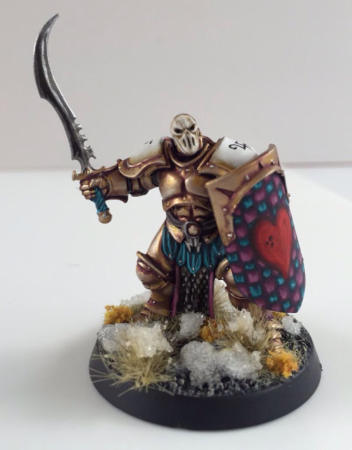
Wow, this photo is fantastic.. A well taken photo is so essential to be able to take a proper look at a mini. The well balanced tones chosen for the colors.. The blue is striking for its' color alone, but it balances the gold so nicely that both colors IMHO enhance the other. Another really nice aspect of this mini is the even and well painted whites. The solid color seems to bring out the depth of transition in the rest of the tones on the mini. Through a nicely shaded and highlighted blue, Les has done a great job of making the armour look like multiple pieces instead of simply a blob of color, keeping interest in each joint and visually separating the mini into many parts.
A very interesting choice that was made as well is the asymmetrical spot colors. I would consider these colors the white and the silver. The white is on the shoulder pads and shield, creating a bit of visual weight on the right hand of the mini. This has been balanced by the silver on the tabard and hammer creating weight on the left of the figure moving the viewers eye around the whole model. Typically a single spot color will be balanced throughout the figure, but Les has done the same with two.
If I had to pick out two areas for improvement, I would choose (ironically) the picture ;) I would like to see more angles of the paint job, so just add more pics ;). Number two, the black of the axe haft, belt, and tabard. From this angle it does not look to have as much depth as the other colors.
That being said, This is a very dynamic and beautiful mini, and the votes it received absolutely reflect that.


Chris has done a great job with a simple head swap and weapon swap.. The character of the mini is completely changed. The paint job again has white shoulders , but switches the white shield of Les for the white Delf head. By creating a straight line of white and adding more contrast to the face in the center, there is a distinct focus on the helmet. This draws the viewer to the changes made and the unique character. A well done conversion should look seamless and this one does. The weapon swap also changes the silhouette of the figure, the length of the sword balancing the weight of the shield on the opposite hand.
The shield itself would provide a large visual weight if painted in a solid color, but a nice choice to paint a checkered formation breaks up the size. These two spot colors are echoed on the bottom half of the figure, creating a weight to the figure.
The freehand is used in a way that accentuate the shoulders breaking up the larger white fields of the shoulder pads to allow the helmet dominate the line of sight.
If I had to pick two areas of improvement, the first would be that the pink and blue spot colors really accentuate each other in close proximity.. I would like to have seen the alternation continue on the leather skirt and leather pommel across the miniature. The second is that I wish the top white highlight on the helmet matched the top white highlight on the shoulder pads. I like the depth of the brown, but I think the head would pop a bit more if it matched the brightness. These are rather finicky things I know ;)
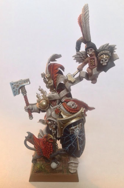


And finally Bishmeister's entry.
This a fantastic conversion of the figure as a whole that really transforms the mini. I talked about the silhouette on Chris's mini, and this one takes it even further. The amount of detail is managed well with a smaller number of colors. The red, white, and black scheme gives a nice balance to the stance and allows the eye to rest a bit.
The gold spot color also enriches the palette quite nicely by drawing the eye to shield and hammer with their beautiful freehand. Speaking of the freehand, it is really nice to see the lighting and hammer of the stormcast background rendered so nicely. My favorite bit of conversion on this model is the bit that you don't recognize. Namely, the 3-D lightning scraped off and replaced with that fantastic freehand lightning.
This mini has IMHO fulfilled the gravitas and weight of a legend of the past rising once more to fight the good fight.
If I had to pick two things to improve this mini , they would be (and they are very picky) to either fill in the script on the ribbon from the stormcast's hip and paint it to match the ribbon to the cherub, or freehand script on the ribbon to the cherub to match those two flowing lines, and second. I really wish the shield (and hammer) on the cherub had the same gorgeous lightning freehand as the mini's shield and hammer. (As I said very very picky)
Thanks to Les, Chris, and Bishmeister for allowing me to critique your minis, and to all, please let me know what you agree/disagree about!