In Part 3, I work on modeling the floor.
Alright. So I have my blockout done. I have a reference model in my scene to compare to when modeling and I have my grid set in Maya to help me model at the proper size. The settings were a pain to get right so I’ll go over those quick.
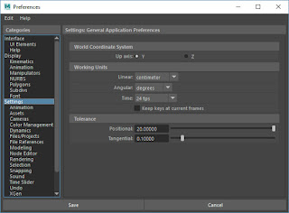
I’m using Maya 2018, but these settings haven’t changed in years and should be the same in most versions of Maya. The first thing you want to do is change your measurements to centimeters. Go to Windows > Settings/Preferences > Preferences. From the categories on the left, click on Settings. Under Working Units set Linear to centimeter. Once complete, click Save at the bottom.
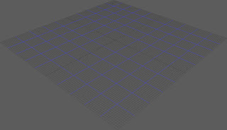
The next thing you want to set your grid in Maya. I wanted mine set for 1 mm squares and I also wanted larger squares at 10 mm (1 cm). This will make it easy to scale and size my terrain. In Maya click on Display and look for Grid. Next to the word Grid there is a box. When you click on the box a dialog menu will open. Set Length and Width to 500, Gridlines to every 100, and Subdivisions to 10. You can also set the color of your Axes, Grid Lines, and Subdivision Lines if you want. Once complete click Apply and Close. You�ll end up with a grid 100 mm x 100 mm with the smaller squares at 1 mm x 1 mm and larger squares at 10 mm x 10 mm. Perfect!
I’m starting with the floor as that is the base that everything is built off of and it should be the easiest to start out with. For reference, I’m using the actual tiles from the Space Hulk board game and some reference shots of Zone Mortalis. I included my reference below.
I wanted to try and do a tutorial on modeling for 3d, but that goes way beyond the scope of these articles. If anyone has any questions, drop them down in the comments. I can point you in the right direction if you are just starting out with modeling.
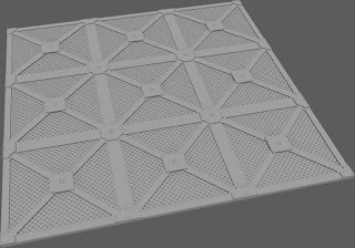
For my first draft, I followed my reference almost exactly. I wasn’t really a fan. It matched the reference, but wasn’t dynamic enough. After staring at it for a few hours I decided to change it up by adding the extra cross pieces. It was close, but not what I wanted. What was I missing? A skull of course! Now I understand why all of the Games Workshop terrain is covered with skulls. They make everything look better!
For my first draft, I followed my reference almost exactly. I wasn’t really a fan. It matched the reference, but wasn’t dynamic enough. After staring at it for a few hours I decided to change it up by adding the extra cross pieces. It was close, but not what I wanted. What was I missing? A skull of course! Now I understand why all of the Games Workshop terrain is covered with skulls. They make everything look better!
I’m happy with the second design and decided to leave it there for now. Next time I’ll work on the wall segments.
Until then,
The Harrower
Until then,
The Harrower


